That tiny stamp in the corner of your social post is the first thing that people begin to recognise. It's a statement: 'THIS IS ME' - so it should reflect who you are, appeal to your audience, and never under - or over-promise what your audience can expect from you.
We'll cover 5 key elements of a solid, effective logo design in a minute, but first, let's quickly touch on why it's so important for your logo to reflect your brand ...
Unintentional Catfishing
A sooped-up logo with bells on - which is more common now with the use of AI - can promise the world ...then fall short of expectations. If you don't have the rest of your brand, your products and ethos up to the same standard, your audience can end up disappointed and quickly disregard you entirely.
The 'Try Harder' Trap
On the other hand, an off-the-shelf logo can suggest a lack of motivation or desire to be special ...and that sentiment can bleed over into how your audience thinks about your products or services. Even if you are amazing at what you do, you're less likely to get a chance to prove it.
First off: Visualise - and feel - your Brand
Before drilling into specifics, I recommend that you explore what your business makes you think of and how it makes you feel. Jot down any words, symbols, colours and emotions that pop into your head. Here's a great little video from Will Paterson on Logo Design, starting from scratch, and using this brainstorming technique.
1. 'You talkin' to ME?': KNOW your audience.
Your logo idea might look brilliant to you ...but does it appeal to YOUR specific market? I always wax lyrical about the importance of using a customer avatar to help you see your brand through the eyes of your ideal customer. It really works, I promise! That way, your logo design will feel relevant to them, helping to build trust in the process.
Imagine you have a health and wellbeing business; you might immediately choose a calm, flowing font and natural blues and greens or even creams to convey a sense of peace and personal growth.
But what if you want to appeal to those who want a more clinical, effective, and efficient solution to a problem? Then you might opt for a clean, modern font, strong blues for solidity, and a bold, sharp design to communicate innovation and professionalism.
Appealing to everyone ...and no one!
As part of your WHOLE BRAND - your tone of voice, brand personality, and message - a logo design that appeals to your market and aligns with your brand will put you ahead of those who want to appeal to 'everyone'. This is not a thing; in marketing, when you try to appeal to everyone, you appeal to no one. True story:)
2. Every Font Tells a Story
The font or typeface you choose for your logo design is just as important as the colours. It’s not just about what the letters say, but how they look. A font can instantly set the mood for your brand.
- Serif fonts have little decorative strokes (or "feet") at the ends of the letters. They often feel classic, trustworthy, and traditional. Think of the logos for a law firm or an established newspaper.
- Sans-serif fonts are clean and simple, without those decorative strokes. They tend to look modern, minimalist, and fresh. They're a popular choice for businesses that want to appear plain-speaking and accessible.
- Script or Handwritten fonts can be playful, elegant, or personal. They are a great choice for brands that want to feel creative or handcrafted, such as a bakery or boutique. But be careful - they can be difficult to read ...particularly when you reduce the logo size for a social post.
Have a play around with different fonts, and you'll quickly see for yourself how each can change the feel of a word.
Comic Sans is not funny
Oh ... and please always avoid Comic Sans. It has been used for every kid's birthday party and bake sale since Microsoft created it in 1994.
Don't go there 🙂
3. Shaping up your Logo Design
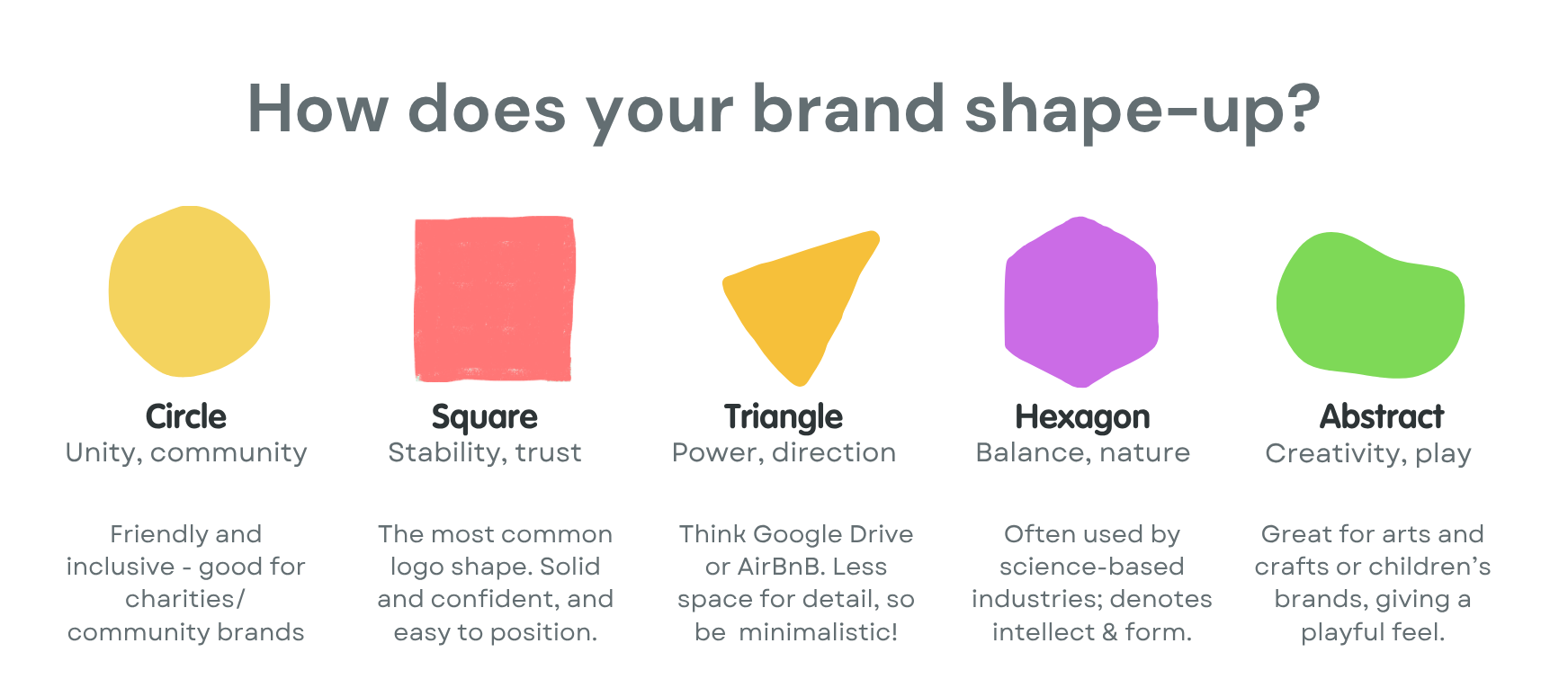
The shape of your logo design also tells a story - albeit, subliminally:
- Circles, ovals, and rounded shapes often suggest community, unity, and a softer, more approachable feel.
- Squares and rectangles give a sense of stability, balance, and professionalism. They feel solid and reliable.
- Triangles and pointed shapes convey energy, direction, and power. They can be forward-thinking and dynamic, perfect for businesses that want to show they're moving forward. However, what they gain in direction, they lose in friendliness - and can be hard to combine with other objects or curated graphics.
- Abstract shapes can give a brand a playful feel - quite literally that the limitations of your potential are not fixed.
Form has real psychological value - so don't overlook the importance of how you contain your logo design.
4. The Power of Colour
Colours have a secret language for your brand. They can make people feel a certain way without them even realising it. Try to avoid choosing YOUR favourite colours (unless they fit the bill), and use a harmony wheel (here's a free one from Canva) to ensure your colours don't shout at each other ...or melt weakly into the mix like an underspiced curry.
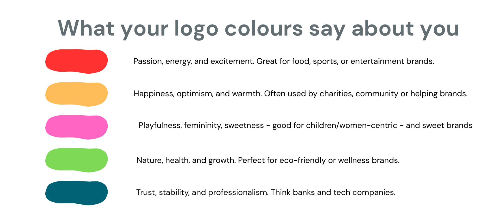
What feelings do you want to evoke in your customers? That's your starting point. If you want people to feel you hold the key to wellbeing, and NOT think of their rising blood pressure, avoid red ...:)
5. Keep It Simple!
One of the most common design pitfalls is that people FORGET their logo will likely be the size of a pea in their posts or business cards. An intricately detailed logo won't be legible, and can also limit where and how it can be used.
Big brands with huge budgets use simple and minimalistic logos because they know this works. Think of iconic logo designs like Nike's swoosh or Apple's apple—they're simple, clean, and instantly recognisable.
Remember: your logo isn't a menu or a manifesto; don't try to include everything your brand stands for (unless you offer one thing, eg, a house; a chicken; ice cream). Your logo should work on everything from a huge billboard to a tiny pen, and still look sharp.
Ready to Create a Logo That Works for You?
Of course, there is a lot more to creating a solid, professional brand logo, but these are the basic foundations that will help you to avoid common pitfalls.
I'd recommend spending time looking at other logos in your industry and making notes of any common elements, colours and shapes. However, if you need a little help with the technical side, or have an idea of what you want but can't quite 'nail it', I'm happy to help. We can work together to design a logo that you can be proud of:)

